
This is a map of the Kanto Region which is the playable environment from the original video game, Pokemon. It was also featured in the anime television series for Pokemon, which the main character Ash traveled around in search of becoming the ultimate Pokemon master!!! I had stumbled upon it from an independent pokemon fan page which was most likely created by an artist not associated with the company of the game.This map is very dynamic in the sense that landmarks and geographical regions are emphasized, something which wasn't really found in the game's original maps. However, it is somewhat impractical for the diehard pokemon trainer because of it's not-so-visible passages and its inaccurate proportions (this is coming from my own experience playing the game). Nevertheless, it's stylized format brings back nostalgic memories from previous players, as well as a fresh, new perspective on the landscape not previously envisioned before. This fantastical map can be found in this link http://www.psypokes.com/rby/map.php.

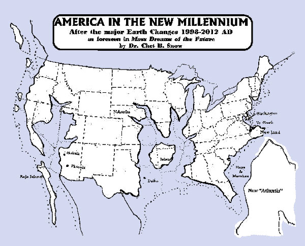
This is a map of the world of the predicted changes that the United States will undergo after the supposed geographic alterations that will happen after 2012. This map was constructed by Dr. Chet Snow, a Phd from Columbia University. Upon perusing his website, it seems that he specializes a wide range of alternative techniques when working with the psyche, especially what many people regard as conspiracy theories. Judging from America's dramatic alterations in this map, he seems to think that the changes to the Earth will happen impulsively and not through natural geological shifting which cannot be accomplished in such a short proposed period of time (1998-2012). This map seeks only to convey the shape of the US in the future compared to the its present day shape because of the lack of geographical features and major nodes. This makes you wonder whether if he used natural observations and science to formulate the new shape or simply envisioned it in a dream. Given the title of the map, its probably the latter. http://www.bibliotecapleyades.net/imagenes_profecias/cambiostierramapas07.jpg

Out of all the maps I've filtered through, this is probably one of the scariest I've encountered. Initially, this map doesn't seem too daunting because of the lack of a legend to distinguish what each of the points symbolize. According to the legend found on a drop down menu, green symbolizes the homes of registered sexual offenders, blue represents the homes of civilians convicted for sexual battery, yellow represents the homes of people with a history of rape, red represents the homes of sexual offenders of children, and white represents a school or a recreational park. Analyzing this map, it seems that the correlation of schools/parks is not necessarily related to the frequency of sexual offenders residing around the area. The obvious difference in the frequencies is based on the district with the numbers much higher around the south/central Los Angeles area compared to coastal communities. This map particularly emphasizes roadways, highways and cities because it goal is to pinpoint the general locations and frequencies of these vile delinquents. This map is a perfect example of the use of GIS for the study of criminal justice, urban planning, and social science. However, its accuracy is restricted to completeness of its data, which doesn't account for non-registered offenders. The program, Family Watchdog, is synchronized with Google Maps, and could be used to track down the offender statistics in virtually any part of the U.S. http://www.familywatchdog.us/ShowMap.asp?frm=0
No comments:
Post a Comment